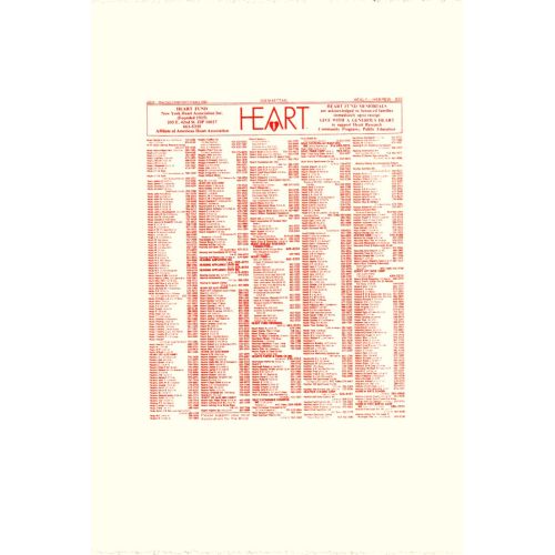
Andy Warhol, New York Heart Association Phonebook Ad
Style
In this artwork, Andy Warhol showcases his signature Pop Art style. As a leading figure of the Pop Art movement in the 1960s, Warhol was known for incorporating popular culture images into his work and challenging traditional notions of art. His tone in this particular piece is vibrant and bold, utilizing bright colors and graphic elements to grab attention. The subject matter of the ad highlights a collaboration between Andy Warhol and the New York Heart Association. The drawing technique employed by Warhol here is reminiscent of commercial illustrations or advertisements found in phonebooks during that era. The colors used are typically vibrant with eye-catching combinations that add to its visual appeal – they aim to capture viewers' attention while conveying an air of urgency around heart health awareness. This artwork is created using various paint mediums; however, due to it being a phonebook advertisement from that time period, it's likely produced using conventional printing techniques rather than traditional paintbrush strokes on canvas. While this specific work may not have extensive symbolic meaning associated with it, it reflects an important aspect of Andy Warhol's artistic career where he engaged with corporations/organizations outside the confines of typical gallery spaces. This signaled his desire to make art accessible beyond elite circles while also exploring consumerism as well as celebrity culture through various media channels. Overall, "Andy Warhol New York Heart Association Phonebook Ad" exemplifies iconic imagery blended seamlessly within everyday life accompanied by lively tones synonymous with Pop Art aesthetics.